
|
|
| Reforming the Interguild |
| Livio | ||
Age: 31 Karma: 470 Posts: 9620 Gender: Male Location: Arizona, USA pm | email |
Oh yeah, I forgot to write about that. I was thinking that I could maintain it the same way I keep the weekly update up every week. I'd probably make it changeable through some sort of staff power, but that's mostly to minimize the amount of effort necessary to actually set this up every week. Shouldn't be too hard to find levels either. It'll either be a level made in the past week, or some random old level that looks good enough to be featured. | |
| jebby | ||
| Interguild Founder Age: 32 Karma: 233 Posts: 968 Gender: Male Location: United Kingdom pm | email |
I prefer the current news system because it shows outsiders that there is actually life existing within this site. I'm turned off by websites that don't have instantly evident life. But not much of a difference, I suppose... Go for it. I think that networking and outside communication is most important (if only I had more time and inclination...) - I recommend that an interguild Youtube channel be made with all the videos we've ever made in it. I'm not sure why that would be a good idea, but perhaps consolidation of all our YT resources would be more noticeable? I don't even know myself lol. | |
| Livio | ||
Age: 31 Karma: 470 Posts: 9620 Gender: Male Location: Arizona, USA pm | email |
that's true about the news posts. I'm thinking that we should use the news system for more things just because it's the part of the community that we show to outsiders. and this is a weird concept I'm testing with the current draft of the design for the new homepage. Right now, about 2/3rds of the horizontal space on the homepage will be dedicated to the level database and featured/recommended levels. Then the other 1/3rd of space will be a list of the latest news updates. I don't know what it is about that set up, but it presents the site as mainly a level database site, but then when you see the news posts on the right and see that the site updates and hosts comps frequently, then you tend to think how cool it is that the site also has a living community with it too. It's hard to explain, but it tends to make you value the fact that the site has a news system and a community, because the site almost presents itself as not needing them. So when you see all of this community stuff, it looks like an extra step and you tend to value it more. Well, you probably don't know what I'm talking about until you see the design, but then again, you already know what this site is so you might not even see it from the perspective of a newcomer. /rambling Anyway, I'm still not sure about this current draft of the new homepage. I might try out some other methods later. Deciding not to show the news post itself is a pretty strange move... | |
| Livio | ||
Age: 31 Karma: 470 Posts: 9620 Gender: Male Location: Arizona, USA pm | email |
About videos, I think we should hold a video comp sometime after the new layout is released (whenever that will be...), as a first step to better advertisement/influence. A Youtube channel with all of the videos we've ever made? If you can add videos that aren't yours to channels, then did that just make our video archive obsolete??? Actually, I don't really know what I'm talking about when it comes to this stuff. | |
| Yaya | ||
Age: 29 Karma: 747 Posts: 5367 Location: Ohio (US) pm | email |
It does sound slightly cool to make the frontpage dedicated to levels, but it seems kinda pointless since very few people have been making levels lately.  COMING SOON: A giant meteor. Please. Give me +karma. Give me +karma. | |
| Livio | ||
Age: 31 Karma: 470 Posts: 9620 Gender: Male Location: Arizona, USA pm | email |
well, it doesn't have to be dedicated to new levels. We could go back and spotlight good but not widely popular old levels like Ck's Burning Summer II or Harumbai's Lockdown Initiated. | |
| Livio | ||
Age: 31 Karma: 470 Posts: 9620 Gender: Male Location: Arizona, USA pm | email |
I'm not sure if I said this already, but I was thinking of getting rid of the short line of text underneath the big "The Interguild" text on the top of the layout because it looked better. Well, I actually decided to bring that back, and we need a replacement phrase. "A Community about Games with User-Created Content" is too abstract and unappealing for the average person. Instead I was thinking of putting something like "A User Level Database Add a New Game of All Games", but I'm not very sure of this, though. | |
| Livio | ||
Age: 31 Karma: 470 Posts: 9620 Gender: Male Location: Arizona, USA pm | email |
You know I've been kinda pushing along all these new ideas of reforming the site, but without any real discussion on it. But that may just be because I have a terrible habit of over-explaining things in giant posts that no one likes to read. So now I want to ask for your opinions. As you hopefully know, the main point of my "new layout" (it's actually more than just a new layout) is to approach the site from a more business-like perspective, and try to attract members with the site's services rather than its community. However, I plan to do this by actually integrating that old idea of a directory of levels from other sites so that our level database (our main selling point) can be even more attractive. This would change the Interguild a lot [edit: mainly with the idea of adding directory levels from other sites], and I want to ask you: are you in favor of such changes? I was browsing through the old forums today (b/c of something that happened in the staff forum  ) and I started re-reading some of the old topics of when we were still thinking about what the new interguild would be. Lol, and as I said in the chatbox, I did a facepalm every time I read one of my posts in those arguments. lol, it got to the point that whenever one of my posts came up I would think "oh no, here comes another fail..." My posts made no sense probably because I just couldn't grasp the idea that my ideas made no sense. 0_o So now I feel stupid and I want to make sure that I really do understand what everyone else is thinking of my ideas. ) and I started re-reading some of the old topics of when we were still thinking about what the new interguild would be. Lol, and as I said in the chatbox, I did a facepalm every time I read one of my posts in those arguments. lol, it got to the point that whenever one of my posts came up I would think "oh no, here comes another fail..." My posts made no sense probably because I just couldn't grasp the idea that my ideas made no sense. 0_o So now I feel stupid and I want to make sure that I really do understand what everyone else is thinking of my ideas. | |
| Isa | ||
| No. I'm an octopus. Age: 31 Karma: 686 Posts: 7833 Gender: Male Location: Uppsala, Sweden - GMT +1 pm | email |
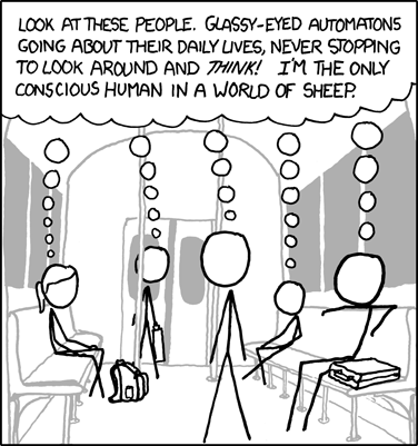
I have the feeling that this picture summarizes the your idea:  | |
| jellsprout | ||
| Lord of Sprout Tower Karma: -2147482799 Posts: 6445 Gender: Male pm | email |
If you want to discuss the lay-out, it might be a good idea to show a prototype. As for the reform itself, as long as what we currently have (forums, our own level/video database, the competitions, etc.) isn't removed or downsized, we could at least try it out. Spoiler: | |
| Livio | ||
Age: 31 Karma: 470 Posts: 9620 Gender: Male Location: Arizona, USA pm | email |
well no, that would be a bad idea. What I mean is to make the level database the priority of this site and basically claim that the site is intended to just be a level database. However, it'll also have a bunch of stuff around it like the video archive, the guides system, competitions archive, and most importantly, all the member stuff like the forums. You might have gotten that idea because I said I made the chatbox smaller, but that was just for aesthetic purposes. The other sections would still be important, but they wouldn't be such an important part of the site when it comes to prioritizing the workload. The reasoning behind all this is that rather than presenting ourselves as a community with common interests in games with UCC, we would instead present the site as a service that you would want to use. And the strong community behind the site makes it even cooler. Because the thing is that while people love good communities, they're not gonna get interested in a site only b/c they're told that the community is cool. I want people to get interested in our level database (using the whole directory thing) and then have our strong community and variety in other stuff (like the vids, comps, guides) to ultimately make them join the site and be active members. And then they'll hopefully tell their friends.  | |
| Isa | ||
| No. I'm an octopus. Age: 31 Karma: 686 Posts: 7833 Gender: Male Location: Uppsala, Sweden - GMT +1 pm | email |
'jellsprout' said: If you want to discuss the lay-out, it might be a good idea to show a prototype. | |
| Livio | ||
Age: 31 Karma: 470 Posts: 9620 Gender: Male Location: Arizona, USA pm | email |
I've been holding back my previews b/c I wanted to save it until I was done, but you know what, I just finished the homepage like 2 days ago, so I'll show you guys that. Oh and warning: I'm gonna release this layout with two color schemes. One light and one dark. So far i've only set up the light color scheme (b/c it's the hardest one to deal with and I wanted to design the layout in a way that the light color scheme would actually look decent, if not good), but it's coded in a way that I could easily add the dark color scheme by making its css file. Anyway, here it is: http://www.interguild.org/templates/newlayout.php | |
| Livio | ||
Age: 31 Karma: 470 Posts: 9620 Gender: Male Location: Arizona, USA pm | email |
I was also trying to figure out a way to add stuff for guides and vids to the bottom of the front page, but what happened was that I just really wanted to stop working on the homepage already and move on to the level database. and the fake preview image on the "featured levels" thing is supposed to change when you rollover the level. The current screenshot is taken directly from our current HATPC main page. | |
| Isa | ||
| No. I'm an octopus. Age: 31 Karma: 686 Posts: 7833 Gender: Male Location: Uppsala, Sweden - GMT +1 pm | email |
That's not too bad. You know, you've made it sound like a really big change, but to me it's not - as of now, I'm in favor of it. | |
| Livio | ||
Age: 31 Karma: 470 Posts: 9620 Gender: Male Location: Arizona, USA pm | email |
well the biggest change is the directory idea. and i know that was a controversial idea, so I wanted to make sure it wasn't too big of a deal if we actually carried it through. Oh, and the "select a game" button and the "Games V" tab on the top will eventually make a list of games appear via javascript where you'll click on the one you want to go. And the "Search Levels V" tab should also activate a javascript thing where a drop down list of other searches will come up like "search videos" or guides or forums. | |
| Silver | ||
Karma: 121 Posts: 3581 Gender: Female pm | email |
That layout looks really cool, but... how are we to tell when there is a new post in the recent posts box? | |
| Isa | ||
| No. I'm an octopus. Age: 31 Karma: 686 Posts: 7833 Gender: Male Location: Uppsala, Sweden - GMT +1 pm | email |
The topic gets bold. | |
| Livio | ||
Age: 31 Karma: 470 Posts: 9620 Gender: Male Location: Arizona, USA pm | email |
btw, in the new Online Members box, rolling over someone's name will also tell you how long ago was their last page load. | |
| jellsprout | ||
| Lord of Sprout Tower Karma: -2147482799 Posts: 6445 Gender: Male pm | email |
It looks pretty nice. A lot more organised than the current front page. Spoiler: | |
| Yaya | ||
Age: 29 Karma: 747 Posts: 5367 Location: Ohio (US) pm | email |
I like it. Like Isa said, you were kinda making a mountain out of a molehill. COMING SOON: A giant meteor. Please. Give me +karma. Give me +karma. | |
| Livio | ||
Age: 31 Karma: 470 Posts: 9620 Gender: Male Location: Arizona, USA pm | email |
oops? well, like I said, I thought most of the controversy would come from the fact that I was going ahead with the directory idea. I know I mentioned it at the front of this topic, but when I realized that no one even mentioned it, I thought that you either missed it (in my massive walls of text) or just ignored it, like what Isa said in his first post in this topic. And I thought that when you guys eventually saw that it really was being done, I thought another debate would erupt like when I first introduced the directory idea. So I wanted to make sure you guys really were in favor of this, rather than just passing it off and ignoring it. And of course, I still had to somehow mess up what I said... | |
| canadianstickdeath | ||
Age: 35 Karma: 350 Posts: 2990 Gender: Male pm | email |
I'm ignoring it, and now, I'm going to go back to doing so. A couple of things: - My username is cut off in the sidebar. I'm missing the right-most pixels of my H. Even if I weren't, it'd look weird being closer to the right side of the bar, rather than the left. - When new posts are bolded/underlined, does it move the display of the rest of the posts down, to where they could be cut off? - I don't really like the way the dates look. Perhaps you could... remove chatbox titles and make the date posted appear when you rollover the username? I never really cared for chatbox titles anyway... - Allowing members to edit their own chatbox posts is a reasonable idea, I guess. We've survived without it, because the chatbox doesn't really care about quality posts and whatnow. Making an edit button for people to edit their own posts might work, if you can fit it in... And you probably can. Just put, like "(EDIT)" after the username, or something). For mods, that'd be annoying, so you could put a master chatbox edit link in the staff panel? - I wonder if you could get more space in that member panel by moving over top the sidebar... Or maybe you could do something with funky JS to get it to expand/contract, float around the screen, and be repositionable/resizable. That'd be crazy.... - Underneath "the interguild", "user level" should be hyphenated. - In the "What is the interguild" blurb, because of the larger text, the space between the first line and the following lines is one (extremely noticeable?) pixel larger than it is elsewhere. - Some topics, like "For what game..." for example, start their ...'s in the wrong place. | |
| jebby | ||
| Interguild Founder Age: 32 Karma: 233 Posts: 968 Gender: Male Location: United Kingdom pm | email |
Hmm... it looks pretty good - just make sure you change the phrase at the top left to 'User Level Database Add a New Game For All Online Games' because we currently have no material from mainstream games. It would be great though if we had a community for modders of mainstream games and a mod database. Now, that would bring in people. We just need to find some modders to get it going. Go to the Rise of Nations Heaven website to see what I'm talking about - the community is outdated, but the services for Rise of Nations on there are excellent. And make sure the community isn't totally neglected on the front page - it's a fairly unique part of the interguild. That's about all I have to say on this for now as I literally only just woke up and need to revise for exams. | |
| Livio | ||
Age: 31 Karma: 470 Posts: 9620 Gender: Male Location: Arizona, USA pm | email |
Quote: My username is cut off in the sidebar. Quote: When new posts are bolded/underlined, does it move the display of the rest of the posts down, to where they could be cut off? Quote: Some topics, like "For what game..." for example, start their ...'s in the wrong place. Quote: Underneath "the interguild", "user level" should be hyphenated. 'jebby' said: just make sure you change the phrase at the top left to 'User Level Database Add a New Game For All Online Games' because we currently have no material from mainstream games. Quote: And make sure the community isn't totally neglected on the front page And about the chatbox changes, the cool thing is that now anyone can click on the date next to their posts, and it'll take them to the edit page. That way we won't have edit buttons everywhere. It may not be user-friendly but members will figure it out eventually. Quote: I don't really like the way the dates look. As for why this whole banner is pretty small, it's because it just looks better that way. I guess while designing the layout, I've grown to dislike the bulkiness of that section of the layout, so I tried to see if I could compress it. And I've already gotten used to the new smaller space, and it's really not that bad... I prefer to look at the new member panel stuff in the new layout than in the old one-- lol or maybe I'm just that biased... | |


« Forum Index < The Interguild Board
In order to post in the forums, you must be logged into your account.
Click here to login.
All games copyrighted to their respective owners.